Best Buy Has A New Logo And It Looks Very Familiar…
Minnesota-based electronics retail giant Best Buy recently announced that they have a new logo and it looks suspiciously similar to another popular logo.
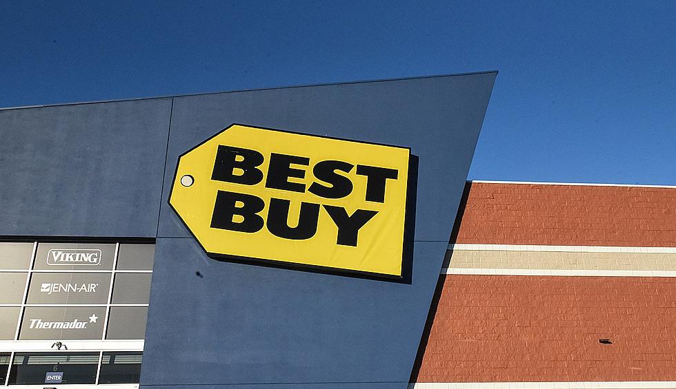
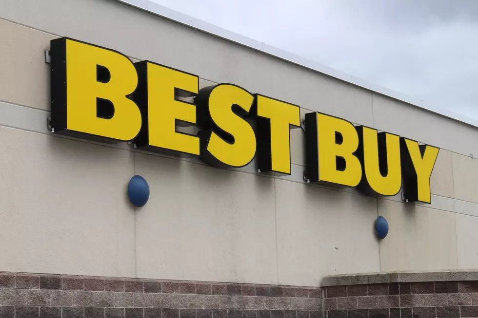
On May 9th, Best Buy announced that for the first time in almost 30 years, they have a new logo. Whit Alexander, the Chief Marketing Officer for Best Buy, was quoted as saying that “The updated logo is true to our heritage, but it’s really cleaned up. It’s an evolution toward the future, and we’re really excited about that.”.
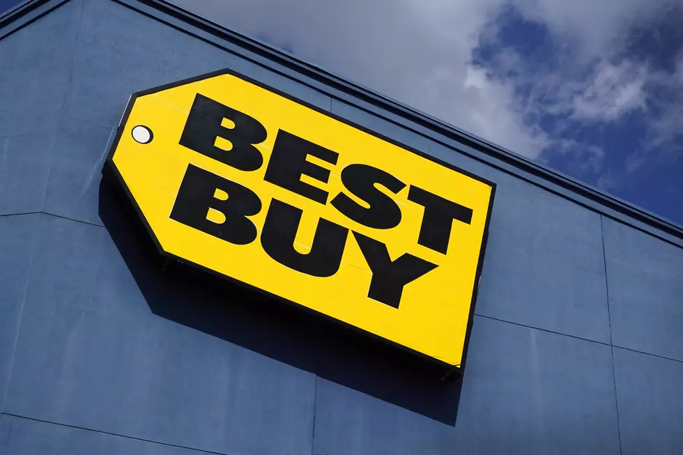
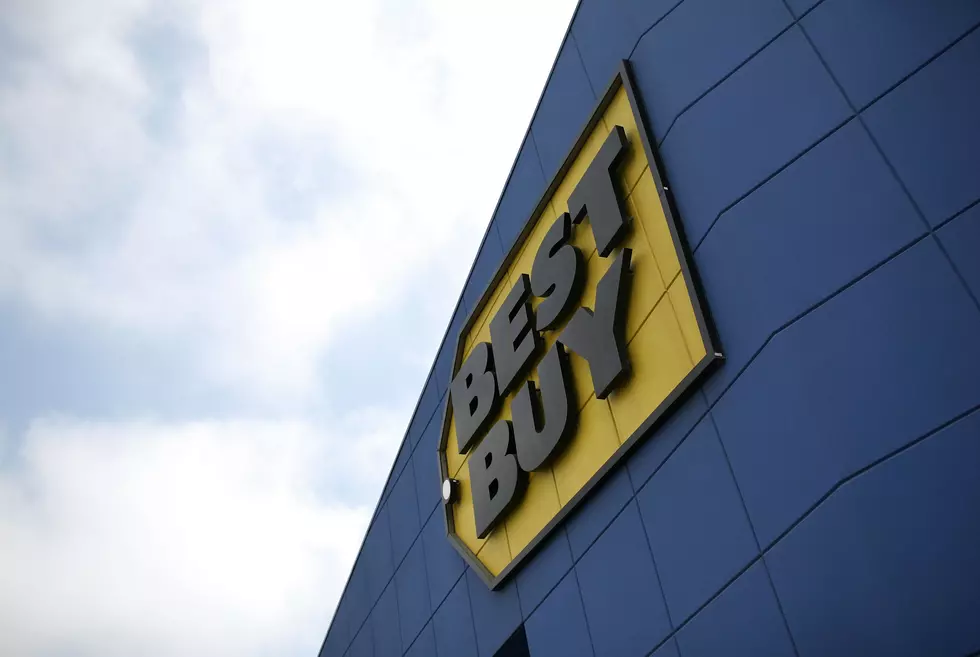
Here is the logo:
Ok, I get it. Big bold letters and the signature yellow price tag, this time just on the side a little. But wait, I've seen this logo before somewhere. Maybe on a weekend night a few too many times?
You can't tell me that these two don't look alike. It might honestly be the exact same font. Maybe it's because it's the blue background in both, but I can't unsee it.
*Ace Ventura voice, Bud Light is Best Buy, Best Buy is Bud Light.
More From MIX 108